 |
| http://intercontinentalcry.org/wp-content/uploads/2012/03/axHu1.jpg |
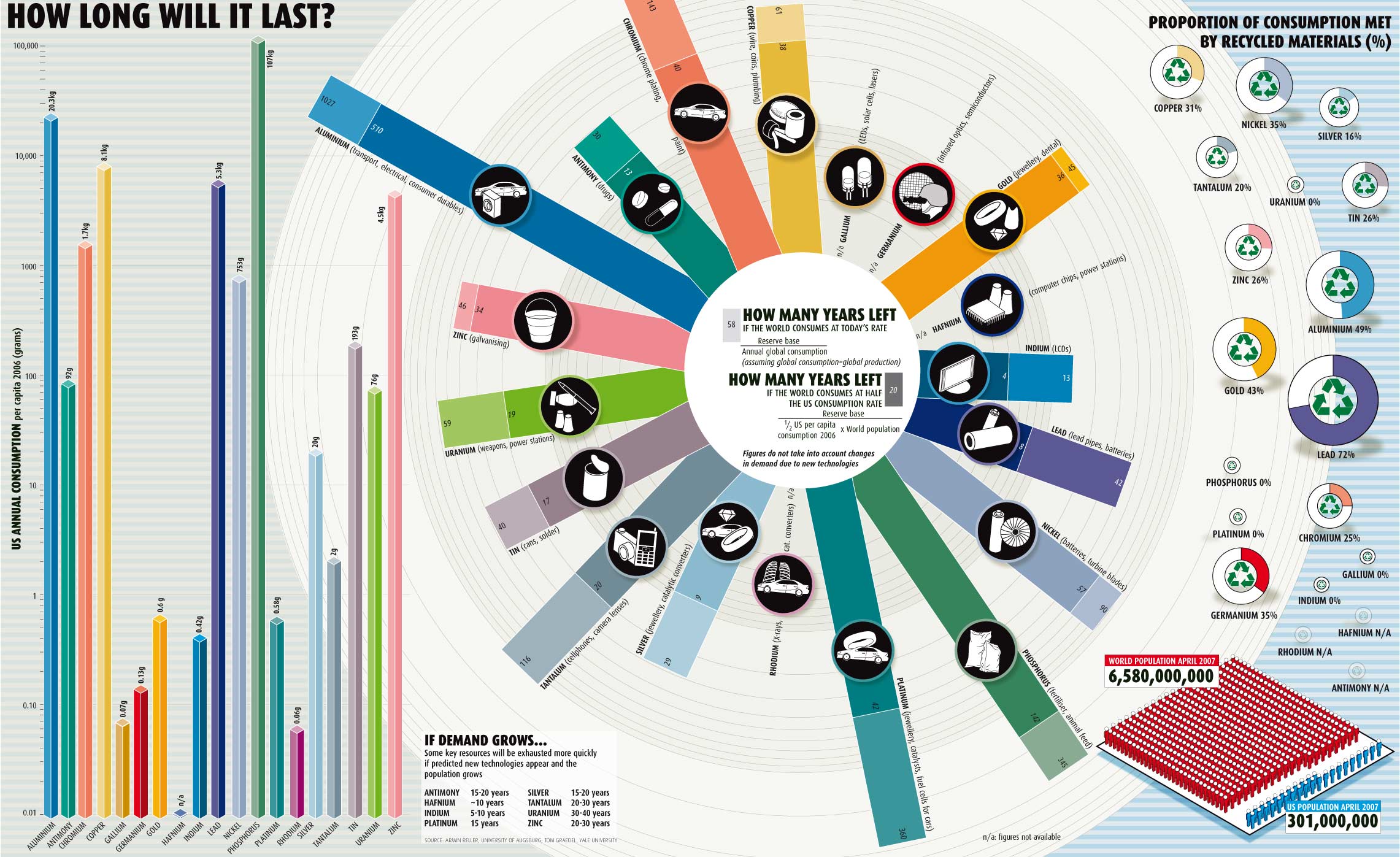
Infographic by Armin Reller of the University of Augsburg and Tom Graedel of Yale University.
What happens when the world's supply of zinc runs out, followed by gold, copper, chromium, platinum, nickle and lead?
This 2009 infographic shows the consumption rate of these and other minerals and how much time before those supplies run out. It also shows how long those same minerals would last if the world’s per capita consumption rate was just half that of the United States.
This environmental infographic shows consumption levels of various materials and relative timelines until we run out of them. It also shows the impact of American consumption, in particular, and makes the point by showing the even worse spot we’d be in if the world’s per capita consumption rate was just half that of the United States.
Source: http://intercontinentalcry.org/infographic-how-long-will-it-last/